Resume Formatting Guidelines That Land Interviews
Your resume’s format is its first handshake. Long before a hiring manager reads a single word about your skills, they've already made a judgment based on how your resume looks.
Is it clean, organized, and easy to skim? Or is it a chaotic mess of different fonts and weird spacing?
Think of it this way: a sloppy, inconsistent layout screams "lack of attention to detail." In a sea of applicants, that visual first impression is a test you absolutely have to pass.
Why Resume Formatting Is Your First Test
The real challenge? You're not just writing for a person. Your resume needs to impress two very different audiences at once: a human recruiter and a robot.
Good formatting is what gets you past both gatekeepers.
The Human Element
Recruiters are busy. In fact, they're probably only giving your resume a quick 6-7 second glance initially. You have to make those seconds count.
A well-formatted resume uses plenty of white space, clear headings, and scannable bullet points to guide the reader's eye straight to the good stuff—your biggest achievements and most relevant skills. You're not just making it pretty; you're making their job easier.
The Software Hurdle
And then there's the software. Most companies use Applicant Tracking Systems (ATS) to filter resumes before a human ever sees them. These systems can't read fancy graphics or confusing layouts. A clean, simple format ensures the machine can actually understand your qualifications.
Don't underestimate how critical this is. A staggering 73% of hiring managers will toss a resume simply because of bad formatting. And a simple typo? That could get you rejected by 77% of them.
When every detail matters, a clean design is your best friend. For a deeper dive into what recruiters are looking for, you can review the full analysis of U.S. hiring trends on High5Test.
These guidelines are all about nailing both parts of the equation, ensuring your skills and experience get the attention they deserve from both the bots and the humans.
Choosing a Format That Tells Your Career Story
Your resume's format is the foundation of your entire job application. Think of it as the framework that holds your career narrative together. Picking the right one isn't about following rigid rules; it’s about strategy. You need to choose the structure that shines the brightest spotlight on your best qualifications.
For most people, the reverse-chronological format is the undisputed champion. It’s the classic layout everyone knows: start with your most recent job and work your way backward. If you've got a steady, traditional career path, this is almost always your best bet. It’s clean, easy for recruiters to follow, and clearly demonstrates your growth over time.
This flowchart breaks down the decision-making process perfectly, showing why a simple, clear format wins out every time.
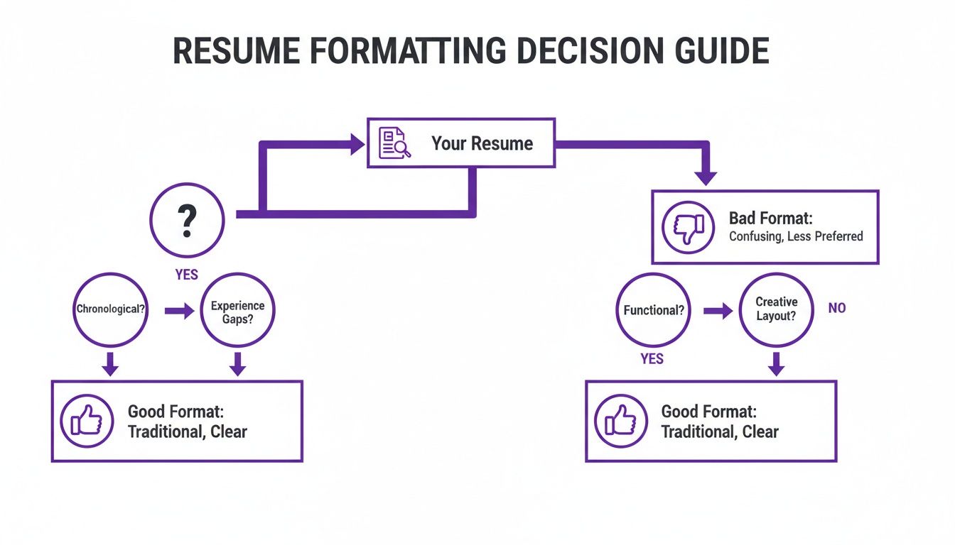
Whether a human or a robot is reading your resume first, a straightforward format is always the smarter choice. It just works.
Which Resume Format Is Right for You
Choosing between the big three formats—reverse-chronological, functional, and hybrid—depends entirely on your personal career journey. This quick table breaks down who should use each one and why.
| Format Type | Best For | ATS Friendliness | Key Feature |
|---|---|---|---|
| Reverse-Chronological | Professionals with a consistent career path, students, and recent graduates. | Excellent. It's the standard format ATS systems are built to parse. | Showcases a clear and linear progression of work experience and career growth. |
| Functional | Career changers, individuals with significant employment gaps, or those with highly specialized skills. | Poor to Fair. Many ATS struggle with this format's lack of a clear timeline. | Emphasizes transferable skills and abilities over a strict work history. |
| Hybrid (Combination) | Experienced professionals with a mix of skills and a strong work history they want to highlight. | Good. Balances skill sections with a clear timeline, making it generally parsable. | Combines a prominent skills summary with a condensed chronological work history. |
Ultimately, the goal is to present your experience in the most compelling way possible for the specific job you're targeting.
When to Break From Tradition
Of course, not everyone has a neat, linear career path. What if you're switching industries or have some gaps in your employment history?
That’s where a functional format can come in handy. This style flips the script, pushing your work history to the background and putting your transferable skills front and center. You’d group your accomplishments under headings like "Project Management" or "Content Strategy" instead of company names.
For those who want the best of both worlds, the hybrid format is a powerful middle ground. It usually kicks off with a detailed skills summary before moving into a more condensed reverse-chronological work history. This gives you the space to show off your specialized expertise while still giving recruiters the timeline they expect to see.
The reverse-chronological resume format reigns supreme as the gold standard, recommended by most hiring managers for its clarity and ATS compatibility. Its structure directly addresses the 34% of recruiters who cite a lack of quantifiable results as a dealbreaker. Even with 79% of managers now tolerating employment gaps, this format remains the most effective way to show career progression. Read the full analysis on preferred resume formats to learn more. Discover more insights about 2025 resume format trends on Resumly.ai.
No matter which format you lean toward, making sure it plays well with automated screeners is a must. To see what a properly formatted resume looks like in practice, check out our guide on ATS-friendly resume examples.
Designing Your Resume for Readability
You could have the most stellar career history in the world, but if it’s trapped in a wall of text, it’s not going to land you an interview. Let's be real: recruiters spend just a few seconds on each resume. The visual design isn't just about looking pretty; it's about making a recruiter's job easier by guiding their eyes straight to your most impressive qualifications.
First things first, let's talk about the foundation of your resume's layout. Set your margins to one inch on all sides. This is non-negotiable. That clean white space around the edges prevents the page from feeling cluttered and overwhelming, making your content much more inviting to read.
A clean structure doesn't just look good to a human—it's also critical for getting past the initial screening by Applicant Tracking Systems (ATS). If you're ever worried about how a robot will see your resume, running it through a good resume ATS scanner before you hit "apply" can save you a lot of guesswork.
Choosing Fonts and Sizes
The font you choose says a lot about you, and on a resume, it should say "professional and easy to read." Stick with clean, classic sans-serif fonts that look sharp on any screen.
- My Go-To Fonts: You can't go wrong with Calibri, Arial, Helvetica, or Verdana. They are universally available and, most importantly, are easily read by ATS software.
- Fonts to Avoid: Ditch the fancy script or overly stylized fonts. They might look cool, but they're a nightmare for readability and can completely trip up automated scanners.
Creating a visual hierarchy with font size is a simple trick that makes a huge difference. Your name should be the biggest thing on the page, followed by section headers, then the body text.
Pro Tip: Keep your main body text between a 10 and 12-point font. Your section headings can pop a bit more at 14 to 16 points. This creates a clear roadmap for the reader, making your resume a breeze to skim through.
Using Formatting for Emphasis
Consistent formatting is what separates a polished, professional resume from a sloppy one. Think of bold, italics, and bullet points as your tools for highlighting the good stuff. Bolding is perfect for making job titles, company names, or killer metrics (like "Increased sales by 15%") stand out instantly.
Instead of writing dense paragraphs about your duties, use bullet points. They break your responsibilities and achievements down into bite-sized, action-packed statements that a hiring manager can digest in seconds.
The key here is consistency. If you bold one job title, you better bold them all. This small detail shows you’re meticulous and have respect for the person reading your resume.
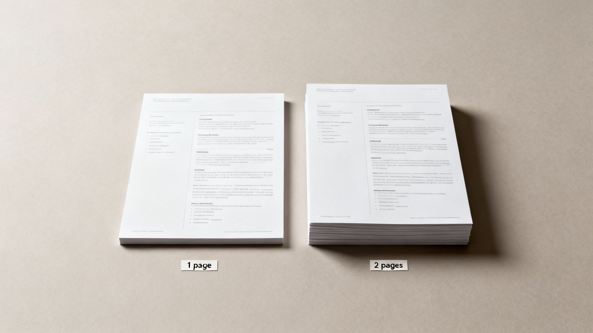
How Long Should a Resume Be Today?
Let's debunk one of the oldest career myths out there: the strict "one-page resume" rule. The truth is, the perfect resume length isn't about hitting a magic number. It's about powerfully showcasing your value without wasting a recruiter's time. Every single line on your resume has to earn its keep.
So, when does one page make the most sense? If you're a student, a recent grad, or a professional with under ten years of experience, a single, hard-hitting page is almost always your best bet. This constraint forces you to be ruthless with your editing, focusing only on your most impressive accomplishments—which is exactly what hiring managers are looking for.
Keeping it to one page helps you trim the fat from your early career, leaving a clean, compelling snapshot of what you bring to the table. While resume length has its own conventions, it can be helpful to understand the general guidelines for optimal document length for other types of writing to get a feel for what makes content effective.
When Two Pages Are Better Than One
But what about seasoned pros? For senior-level professionals, executives, or technical specialists with a long history of projects, a two-page resume is not only acceptable but often expected. Trying to cram 15+ years of leadership experience onto a single page actually does you a disservice. It might even signal that you're downplaying your seniority or, worse, don't have enough significant achievements to warrant more space.
The key here is that the second page has to be just as strong as the first. It should be packed with high-impact achievements and critical projects, not just filler from jobs you had a decade ago. If your second page only has a few lonely lines dangling at the top, it’s a clear sign you need to edit back down to one strong page.
The winds have definitely shifted on this topic. Today, 54% of hiring managers actually prefer two-page resumes, and a whopping 70% are more likely to consider them. This is especially true now that 83% of companies use AI to scan resumes, which can favor more detailed, keyword-rich documents. You can see more of the latest resume length statistics and preferences at ResumeGenius.
Ultimately, your experience level should dictate the length. Don't add fluff just to reach a second page, and don't cut career-defining achievements to stick to one. Let the value you offer guide your decision.
Building Each Resume Section for Maximum Impact
Now that you’ve got a clean, professional format, it's time to dig into the actual content of your resume. Each and every section—from your contact info to your education—needs to pull its weight and contribute to a compelling story about you. The goal is to make every single line count.

This process starts right at the top with your professional summary. Think of this short, 2-3 sentence paragraph as your elevator pitch. It has one job: to grab the recruiter’s attention by showcasing your most valuable skills and a killer achievement. If you’re staring at a blank page, a good resume summary generator can be a great way to get the ball rolling.
Crafting Your Experience Section
Let’s be honest, this is the heart of your resume. This is where you prove you can do the job. The biggest mistake I see people make here is simply listing their duties. Instead, you need to focus on your achievements. Use powerful action verbs and, whenever you can, slap a number on your results to show your real-world impact.
- Weak: "Responsible for managing social media accounts."
- Strong: "Drove a 25% increase in social media engagement across three platforms by implementing a new content strategy."
See the difference? That small shift from responsibility to achievement changes everything. You’re no longer just a person who did a task; you're a professional who delivered tangible, measurable results.
Don’t just state what you did; prove your value with numbers. Metrics like percentages, dollar amounts, and timeframes are the most convincing evidence of your capabilities. Recruiters are trained to look for this proof.
Optimizing Your Skills and Education
Your skills section shouldn't be a laundry list of everything you've ever done. It needs to be a curated, targeted list that speaks directly to the job you want. The easiest way to do this is to mirror the keywords and technologies mentioned right in the job description. This is a simple but incredibly effective way to get past those pesky ATS scans.
Breaking your skills into categories also makes it much easier for a human to scan.
- Technical Skills: JavaScript, Python, HubSpot, Google Analytics
- Soft Skills: Project Management, Public Speaking, Team Leadership
Finally, your education section. Keep it brief. Unless you’re a recent grad, all you need is your degree, university, and graduation year. No need to include your GPA or coursework unless it's highly relevant and impressive.
As you polish each part of your resume, it’s a good idea to check out some LinkedIn About section examples for your professional summary. Your LinkedIn profile is often the next click for a recruiter, so making sure they're aligned is a smart move.
Got Lingering Resume Formatting Questions? Let's Settle Them.
Even after you've dotted every 'i' and crossed every 't', a few nagging questions always seem to pop up right before you hit "submit." It happens to everyone. Let's walk through some of the most common head-scratchers so you can send off your application with total confidence.
One of the biggest questions I get is about photos. For jobs in the US, UK, and Canada, the answer is a hard no. You might think a headshot adds a personal touch, but it can unintentionally introduce bias into the hiring process. Worse, it can completely trip up an Applicant Tracking System (ATS), getting your resume tossed before a human ever sees it. Unless you're an actor or model, skip the photo. A clean, professional resume is always your safest bet.
PDF vs. Word Doc: Which One Wins?
This one's a classic debate, but the answer is pretty clear-cut. Always, always send your resume as a PDF unless the application specifically demands a Word document.
Why? A PDF is like a snapshot of your document—it locks in all your careful formatting. No matter what computer or software the recruiter opens it on, it will look exactly how you designed it. A Word doc, on the other hand, can be a mess. Different versions of Word or even different operating systems can wreak havoc on your layout, turning your masterpiece into a jumbled disaster.
The good news is that any modern ATS worth its salt can read and parse PDFs just fine. Sticking with a PDF protects your hard work and ensures you make a polished first impression on both the software and the human on the other side.
How Do I Make My Resume ATS-Friendly?
Ah, the big one: how to get past the bots. The key to formatting for an ATS isn't some secret hack; it's all about simplicity and clarity. Stick with a standard reverse-chronological format and use dead-simple headings like "Work Experience" and "Education." Don't get creative here.
The system is looking for predictable patterns, so you need to avoid anything that can throw it for a loop. That means steering clear of:
- Columns and tables
- Images, graphics, or logos
- Putting your contact info in the header or footer
Stick to a universal, easy-to-read font like Arial or Calibri, and be sure to weave in keywords you find in the job description. If you want to see how your resume stacks up, running it through an online resume scorer can give you a pretty clear picture of how a machine will read it.
Struggling to manage your job applications? Eztrackr helps you organize every detail, from saved jobs to application stats, all in one place. Start tracking your job hunt with Eztrackr today!